
Shortly after the 3-0 win that sealed Finland’s qualification to Euro 2020, the official webshop of the Finnish FA confirmed that they had sold the final replica jerseys of the national team and would not be getting any more Nike stock back until the launch of the jerseys that will feature in the tournament (likely to be March). And yet, the 2019 jerseys, the beautiful Ruisku-inspired away jersey and the “Mother Teresa” home top could not be restocked due to contracts with Nike and the various subsidiaries involved in the mass production.
The Huuhkajat have been wearing Nike jerseys since 2014, most of them just cheap templates of the standard shirts found on your local pub team, with a Finland badge and a 400% markup. I’m guilty of buying them myself, almost all currently live in my big box of kits.
Yet if you look back further, Finland always turned out in the three stripes of Adidas. Throughout the football kit golden years of the 1980s and 90s, Finland turned out in what are now seen as classic strips. Let us not forget, these shirts were all templates too – 2020 may (still unlikely) be the first time Suomi received a bespoke design. Photographs of Jari Litmanen in early 1990s Adidas Equipment gear are always popular on social media.
In anticipation of the launch of the Euro outfits, I’ve chosen my five favourite shirts. Let me know your own favourites in the comments below or on the socials… (Please note the years of the heading are when the photos were taken, some designs lasted 2-3 years or more)
1994 (h)
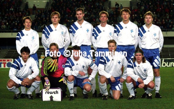
Peak 1990s – similar to the styles worn by Liverpool, France and FC Bayern, this is the one I’d love the most. The Adidas stripes seem to bring the Finnish flag into the design, while the collar and logo placement scream AW2019.
1990 (h)

Seemingly out of tune with the period, if you look at the popular designs at the time, nonetheless this was a time capsule of the late 80s, similar to designs worn by Ireland. Helped in no uncertain terms by Jari Litmanen’s hair.
2003 (h)

Very similar to the designs worn by teams in the 2002 World Cup, this was clean and simple albeit with some mesh on the sides.
1998 (a)

Again, based on the previous World Cup template, but worked well in blue. The stripes were slightly more subtle, on the sides and under the sleeves.
2010 (h)

A controversial choice, the “cow print” design was divisive and not always fondly remembered. Similar to the Greece jersey of the time, it was a bold design that still stood out and incorporated a design that wasn’t just stripes.
The photographs here come from the site of Juha Tamminen, photographer of hundreds of matches featuring Finland, Nottingham Forest, South America and numerous international tournaments. Visit more at this website here https://juhatamminen.photoshelter.com/
